
Why These Images? And What are They?
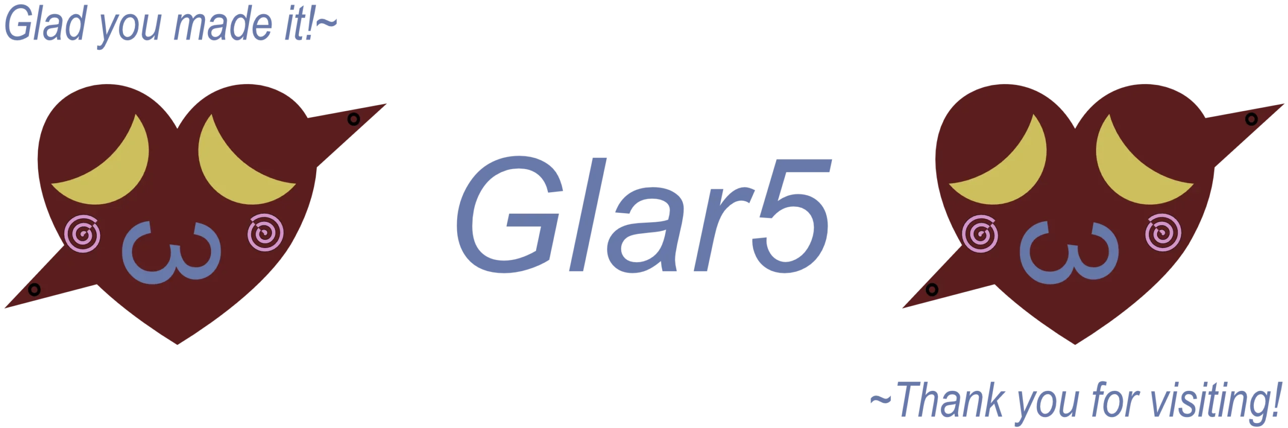
These images are built on some of my favorite things. Firstly, the key part of my logo is the deep, dark red heart with the spiked ends coming out of it diagonally. My favorite shape is the heart because it represents love and life, while the spikes coming from it represent defenses. Then, there are the crescent moons that represent eyes and are capable of carrying emotion. The speech bubble shows the power of speech and contains the name of my online persona, Glar5. The tear drops and spirals were fun little shapes that I wanted to include and the “3” used for the mouth is my favorite emoticon. I decided on the combination of all of these because these shapes have meaning to me, and together they become part of a bigger picture.
Behind the Scenes: Software and Processes
The software I used was Affinity, which was created by Canva. It was a really simple, easy to learn application that allowed me to create my entire logo and header in one place. Specifically, I used the shape tools to make the base of my idea. Then, I used the color tool to find the perfect colors for each shape. The text tool allowed me to add my name, Glar5. Further, I was able to use the grouping tool to combine all of the heart’s details for easy copy and pasting. Lastly, the tool that definitely brought it together the most, was the measuring tools to ensure that everything was lined up properly.
What File Types and Why?
For my file types, I chose PNG for my logo and WebP for my banner/heading. My logo is a PNG file because it is best suited for logos or icons, which is my primarily application for it. I want to use it as a branding, therefore the best choice was PNG. As for my banner, I used WebP because it is optimized to support higher loading speeds. This will help my website load faster which keeps users staying on the page longer since they aren’t waiting a while.
